Digital maps are often the basis or an important feature of modern web applications: to visualise geodata, such as the last jogging route, or to offer users an intuitive input surface. Reason enough to take a closer look at the map material and to find out how to create maps that reflect the design language of the application and respond individually to customer needs.
Prominent examples
One big player that has adapted their own map design to their corporate identity is Strava. They use the map to analyse recorded workouts.
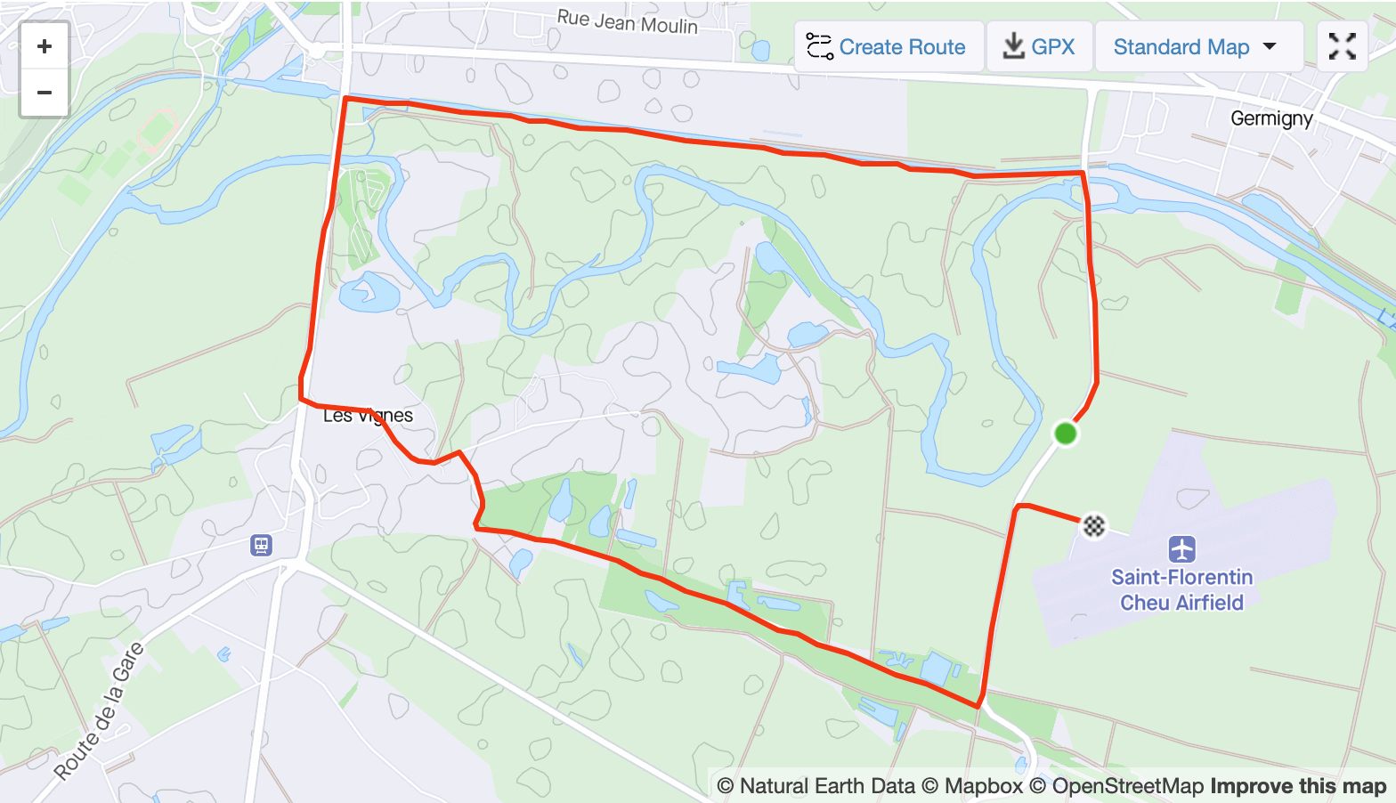
Excerpt from a recording on Strava
What is striking is that the map visually adapts to the rest of the application. We recognise the same main colours as well as the same font. In addition, details have been omitted that do not add much value to the analysis of the route. For example, most of the street or river names are missing. However, striking landscapes can still be seen very well.
Another prominent app that uses specially adapted maps to strengthen recognition is Snapchat. They even used their screenshot in a Halloween edition.
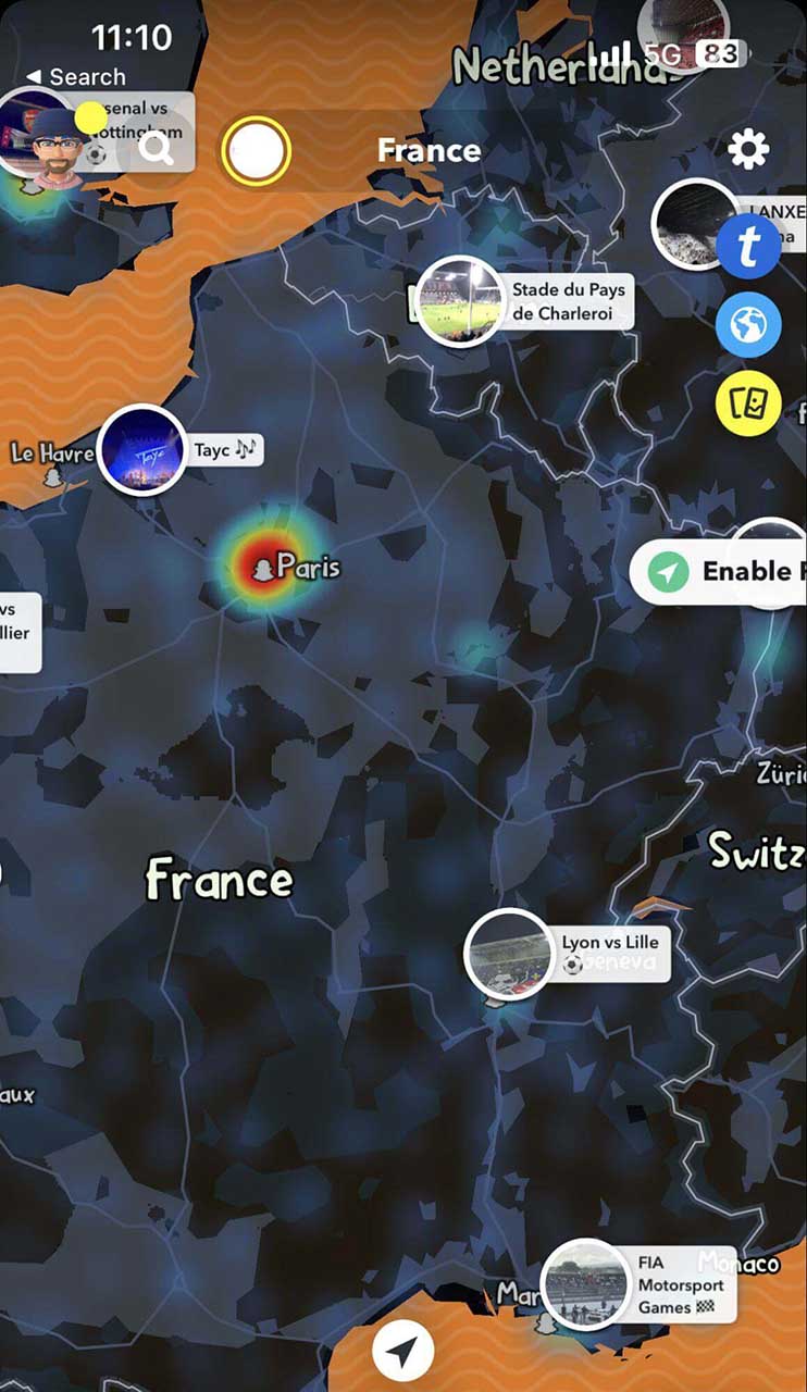
Snapchat uses their map image to reflect the design of the app itself, as with Strava, but also to reinforce customer retention. So users return to the app again and again, not only to send or view new snaps, but also to explore the themed map for details.
Individual maps – made easy
The apps mentioned above have one thing in common: they use the Mapbox API to create their maps. Mapbox is a company that does much more than just maps. But as exciting as the other products are, we will only take a closer look at Mapbox Studio in this article.
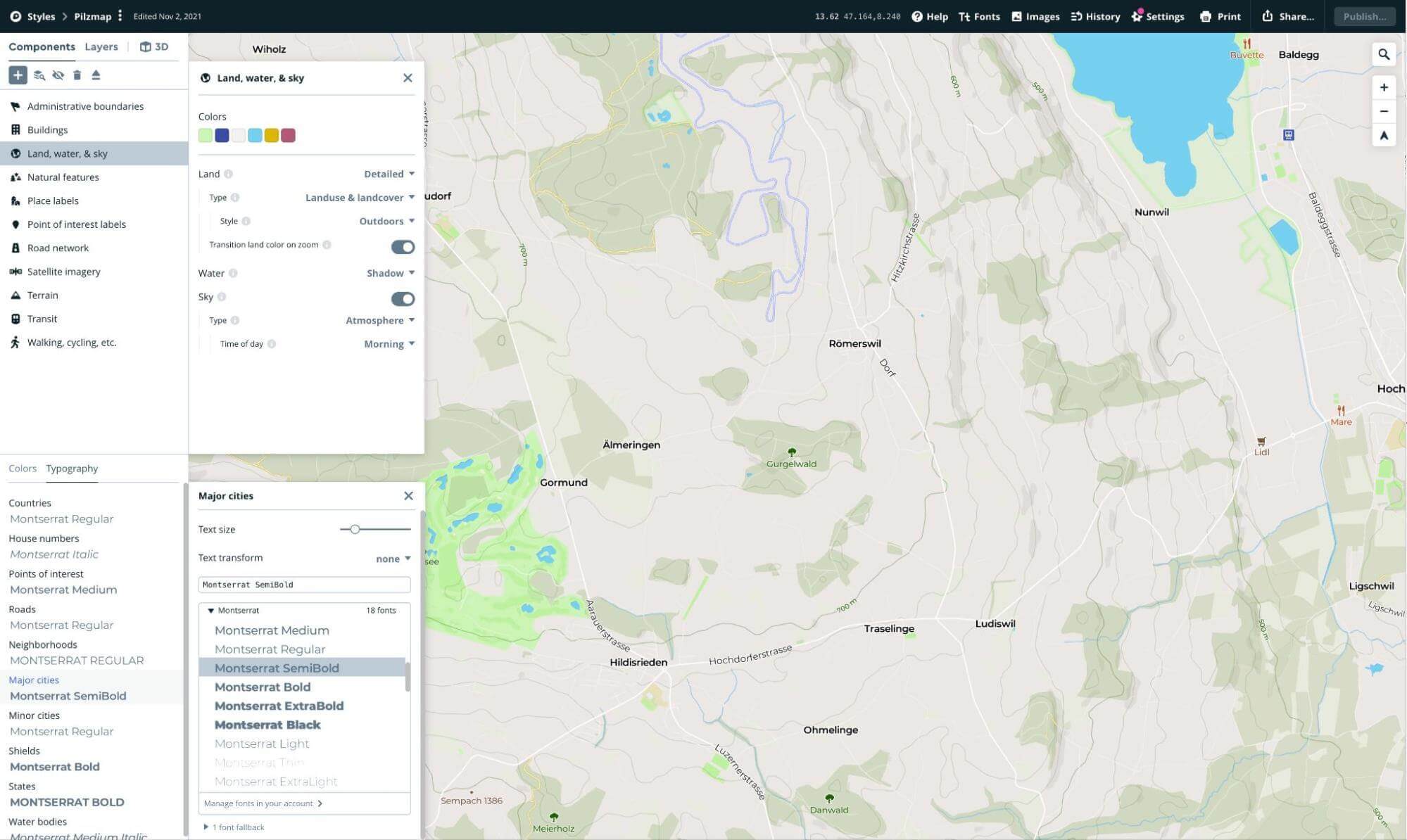
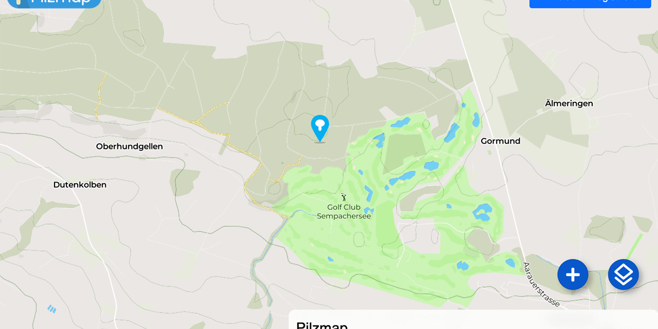
This snippet from Mapbox Studio is for a project we designed during our Learning Week 2021. The idea was to create an interactive app that would allow users to save and document their mushroom picking locations. It should also be possible to share part of the map with friends – except for the super secret mushroom locations, of course. Since the map is the main focus of such an app, we developed our own «Renuo» mushroom map. We adapted the font and the colours to use the Renuo green. We have also hidden details of cities or villages, as the focus is on forests and meadows anyway. Another useful feature that Mapbox provided us with is the blending of satellite images with the normal maps the further you zoom in. This way you can see the overview of exactly where you are in the zoomed out map and every detail of the forest in the zoomed in map.
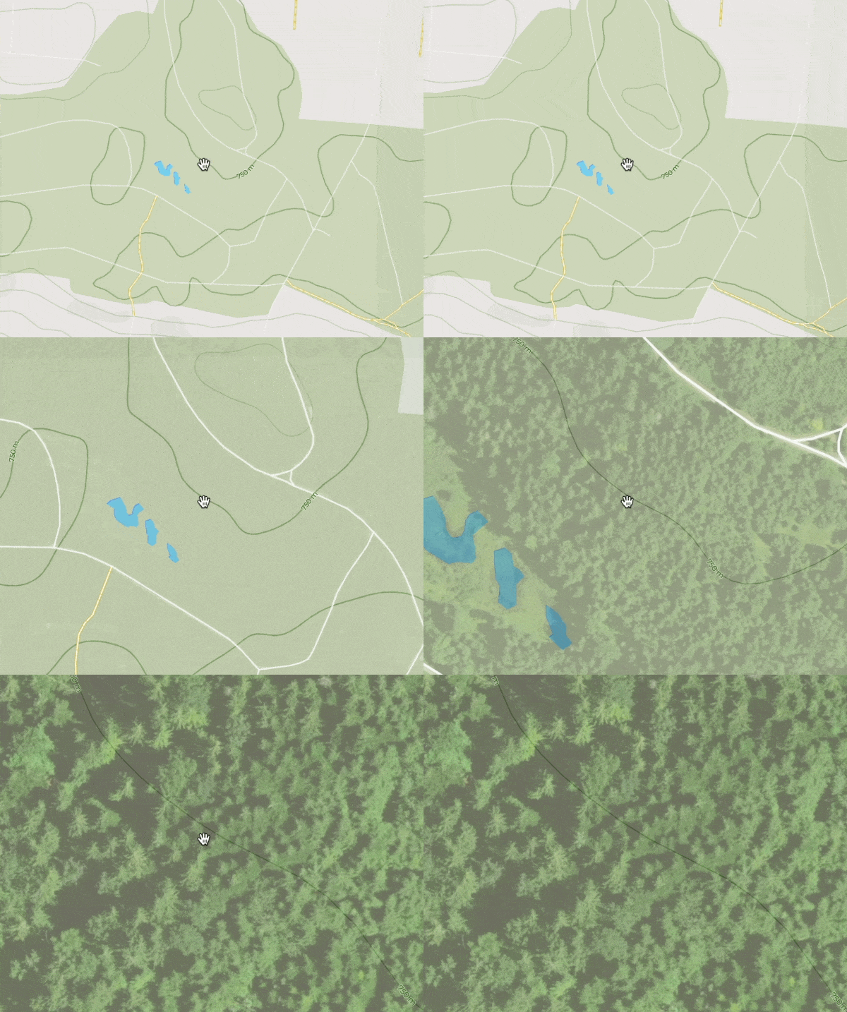
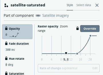
This even goes so far that you can determine the gradient yourself, how fast or slow the map should be shown with which zoom levels:
Other customisations
These are by no means all the possibilities for customising maps. Overlays can also be used to emphasise something important. In the map below, for example, taxiing movements at airfields have been highlighted. Useful use cases of such markers could be area visualisations of aircraft taxiing movements that the app tracks. However, such overlays can also be realised with other map providers. What is special about Mapbox, however, is that they are included in the map material. This means that no code is required, as is the case with Google Maps, for example. Another advantage is that adjustments can be made to the maps without changing code by publishing the latest changes and they are already visible on all end devices.
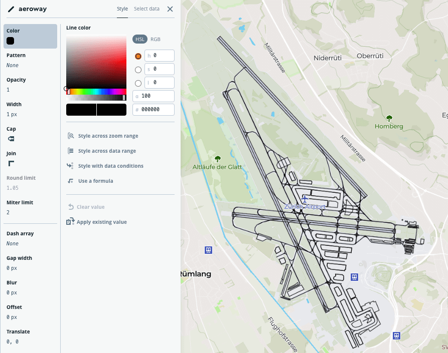
Of course, such paths do not only exist statically on a 2D map. Would you rather have a simulated helicopter flight along a path on a completely customised 3D map? Of course no problem, as Mapbox's example of the FreeCamera API demonstrates:
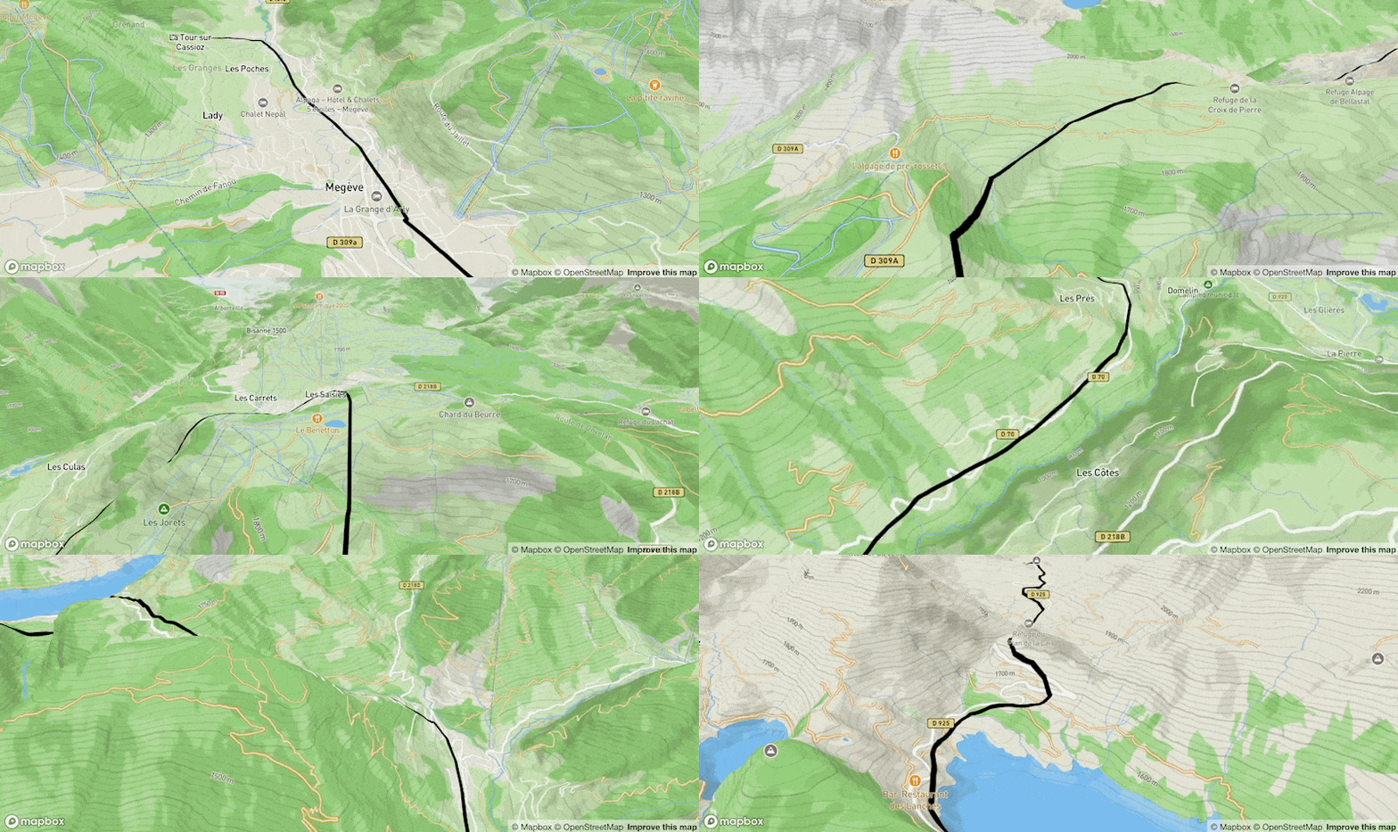
Well, admittedly this is probably more of a gimmick. However, using 3D map material can make sense, especially if we want to visualise a three-dimensional structure such as a building or the interior layout of the premises.
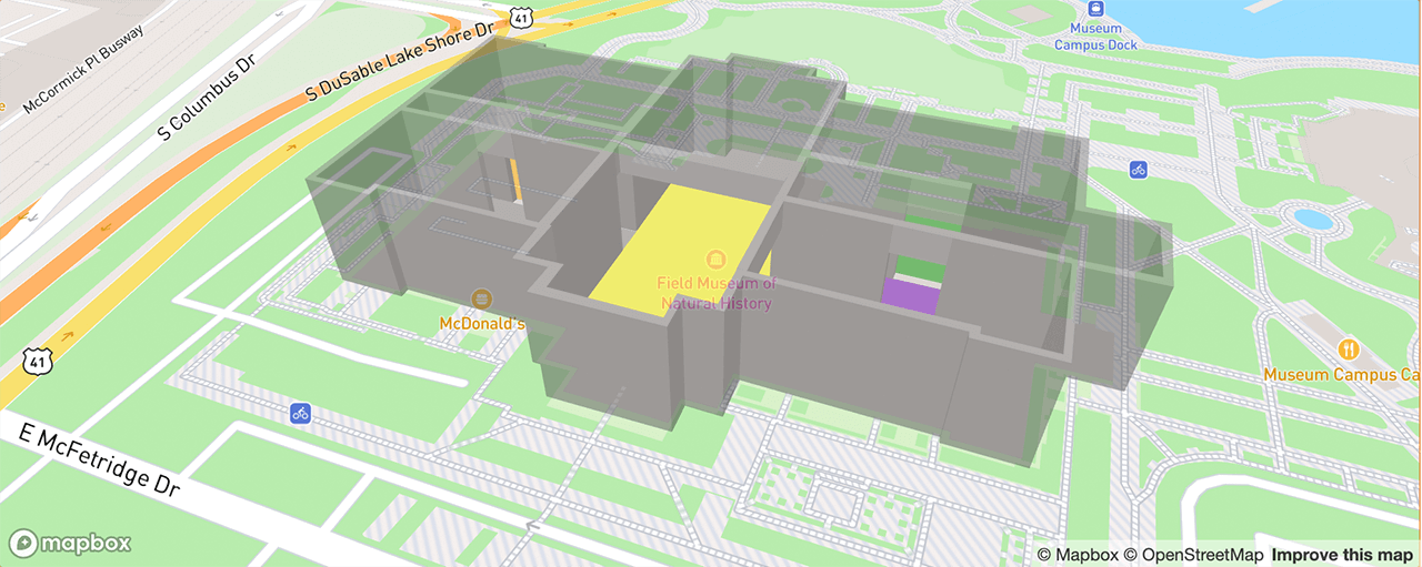
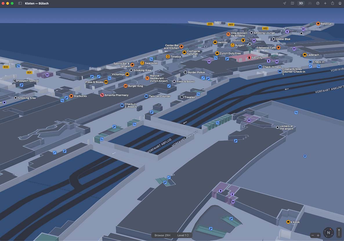
Such interior views are already familiar to users. Apple Maps and Google already offer them on their own maps. The added value is increased all the more if we also offer something like this on our own site. This could be applied to a fashion house, for example. There could be an interior view in which the individual areas are marked, such as T-shirts, jackets, trousers, etc. It would then offer even more added value if the assortment per area could also be browsed virtually. Customers with a tight time budget would be able to find and try on the desired pants they had previously selected.
Conclusion
It doesn't always have to be Google Maps. Even if the API is very powerful and popular, there are alternatives that can hold a candle to Google and also offer significantly more customisation options. Many ideas only come once you have an overview of the possibilities. That's why I recommend to take a look at the examples in the Mapbox GLJS Library, create an account with Mapbox Studio and play around a bit.

